This rebrand was unusual.
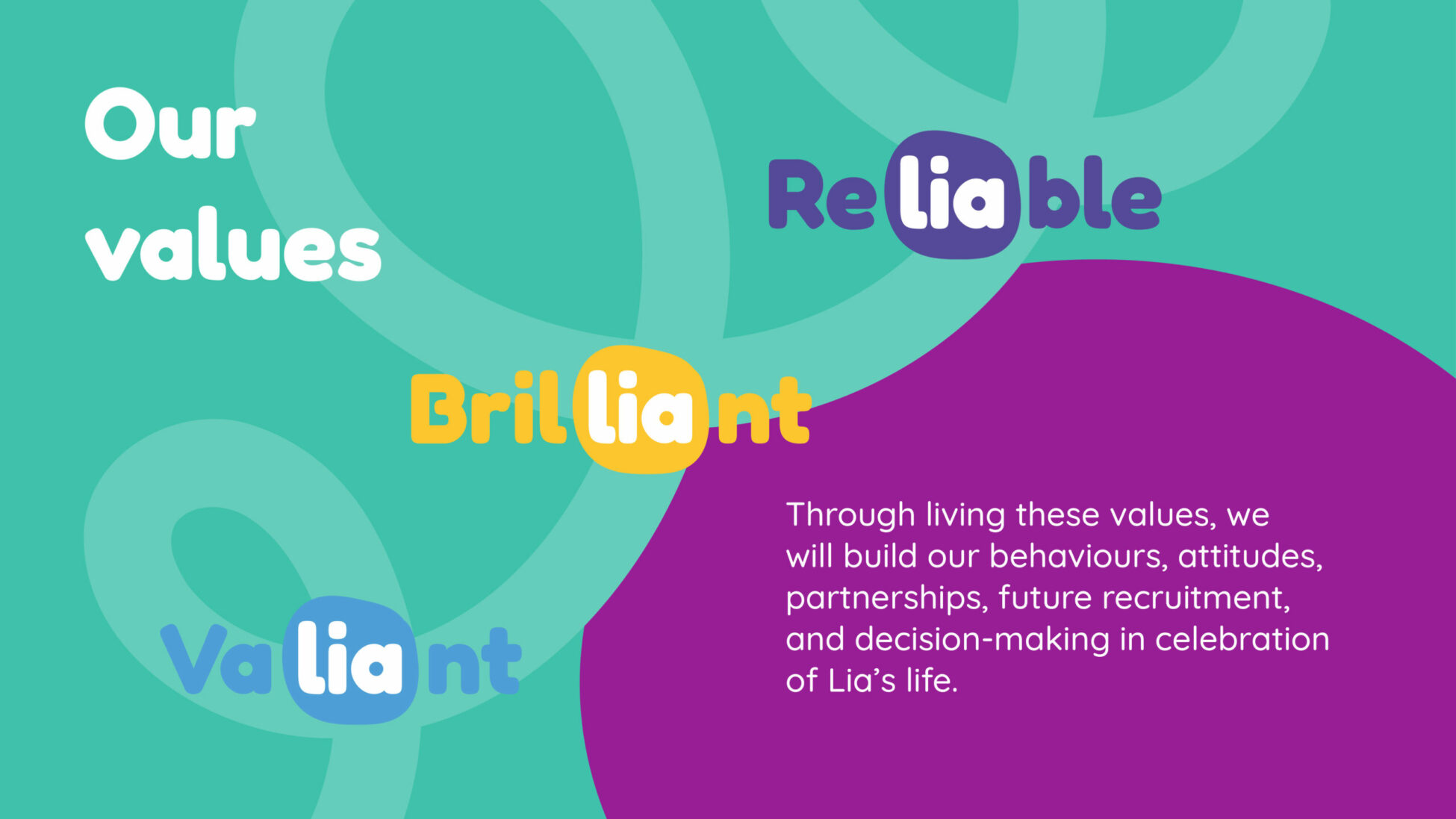
It was driven by the tragic death of a very special young girl. Emilia, or Lia as she preferred to be called, is the daughter of two trustees at Lucy Air Ambulance for Children who died suddenly last September. She was five.
Her parents, Patrick and Melissa Schoennagel, wanted to channel their love for their daughter into something positive. To build a lasting legacy in her name. They wanted to do this for the charity to which their family and Lia were committed. They have pledged to transform this small charity’s future. To fly more babies and children needing specialist hospital care in Lia’s name, and grow the support offered to families in the weeks, months and years that follow a hospital air transfer.
When Helen Holden of Make Create and I were commissioned to take on this special project, the trustees already had a name in mind, Lia’s Wings.
As always, Helen and I started with the values. We had an idea. Lia’s name is in several words. Could we put Lia into the very heart of the charity’s values? In a creative workshop with the staff team, we realised the answer to this was, ‘yes’. The values that form the foundation of the new brand are valiant, reliable, and brilliant.
To read the full story and see the new brand in context visit www.lias-wings.org.uk and get in touch to talk to us about your branding project.
View Project"Lia passing away changed everything for Lucy Air Ambulance for Children. The unexpected, devastating loss of a beautiful life will now enable us to do so much more for children and their families. In Lia’s name, we will continue to grow and be there for all who need us. Our new identity is one we are hugely proud of - thank you to Natasha and Helen for guiding us through this process, we are so pleased with what we have achieved together."
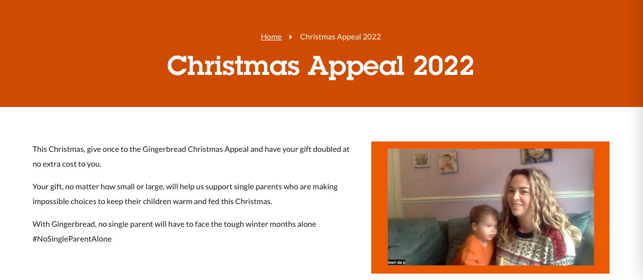
Just before the beginning of lockdown in 2020, we started supporting the fundraising function of Gingerbread, the charity for single parent families. We produced a significant pipeline of grant fundraising opportunities while also supporting the stewardship with existing funders including the National Lottery Communities Fund, City Bridge Trust and Volant. In the space of a few months, we helped them raise over £1.3m.
We then worked again with Gingerbread for six months providing interim fundraising cover during a period of recruitment. The focus of which was to deliver the individual giving plan, deliver a Christmas Appeal and help build relationships with new and existing multi-year funders while a Head of Income Generation was recruited.
"Red Pencil was able very quickly to see what is unique about our offer, articulating things clearly and beautifully, understanding who we are and what we want to achieve, and how to make that palatable for funders. They helped us turn things around in no time at all, particularly for emergency funding. Red Pencil’s length and breadth of experience equip them to spot the best ideas from a mile off." Jo Hardy, Head of Services
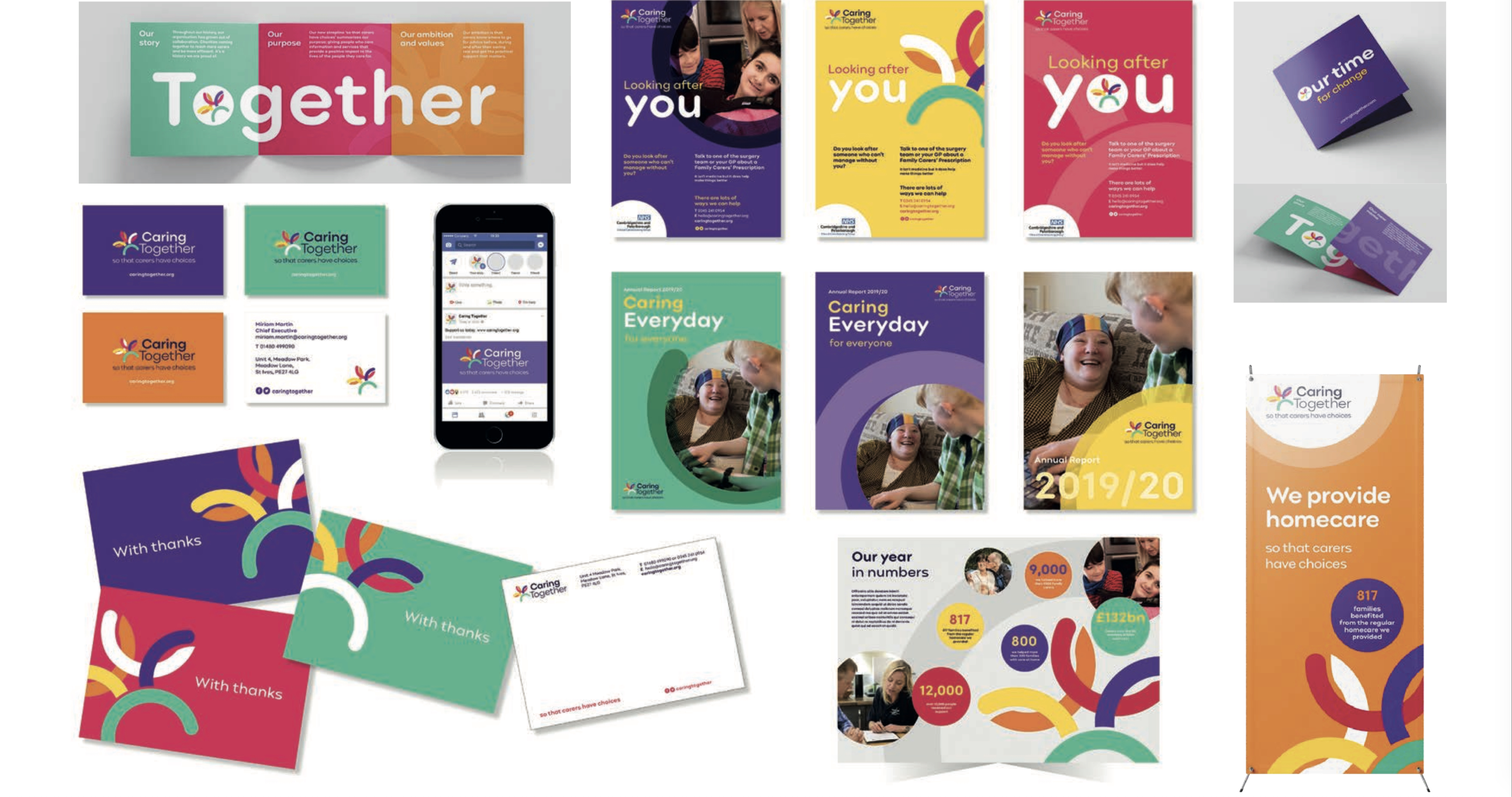
In a collaboration with Helen Holden we rebranded Caring Together from Carers Trust Cambridge Peterborough and Norfolk.
The charity had undergone several mergers in its lifetime and the name told the tale. It needed a clear, new identity that could frame the work and impact it was delivering across East Anglia.
Audience insights research identified a strong theme of connectedness – people who used the charity’s services felt connected to support and connected to other local people in similar circumstances. We tested several name options but in the end Caring Together best summed up the ambitions of the organisation and the impact people using its services told us about.
The new name was paired with a bold new strapline ‘So that carers have choices’ in a clear pledge from Caring Together to give carers back some choice in their lives. Becoming in carer is often not a choice and it can feel very limiting in terms of the impact on the carer. However, choice is important for both carer and the person they care for and this clear statement drives the way Caring Together designs and delivers it services.
Helen designed an inclusive logo and gave the Carers Trust former colour palette a bright, contemporary update to help Caring Together stand out in its marketplace.
"It is like we have always had this brand. It is so straightforward and easy to use." Miriam Martin, CEO
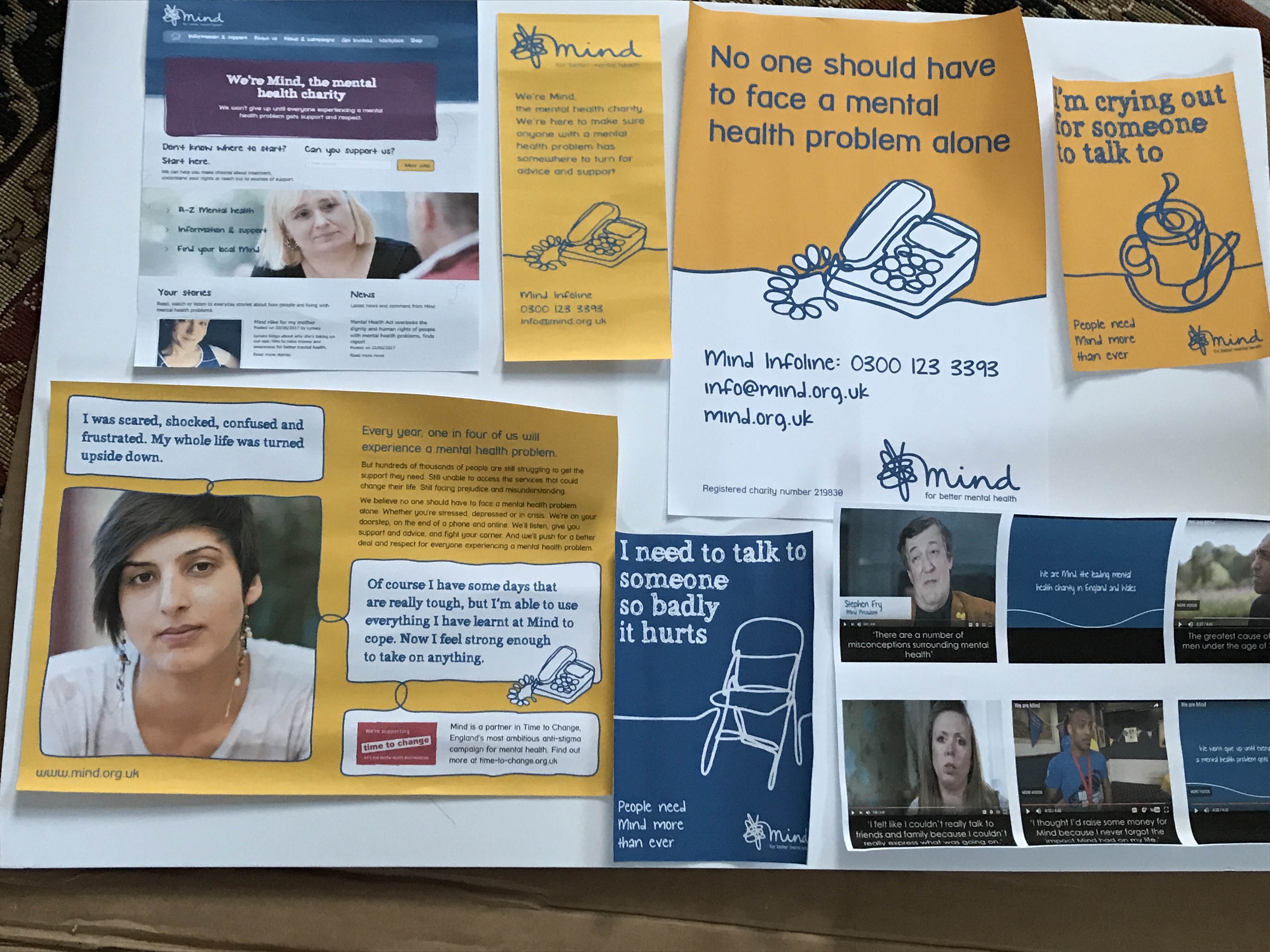
Working with Emily Hayes of Semiotics for Brands, we are running a brand research project for Mind, identifying ways they can reach young black men. The mental health inequalities are dramatic for this audience. They are among the lowest users of support services and present in the highest numbers at points of crisis.
Early on in the project, it became apparent that collaborative communications, producing content and campaigns, in collaboration with young black British men was likely to be the most effective way for Mind to reach them. We therefore took a co-production approach in running the project and focus groups – supported by JJ Bola and Quince Garcia together with local Minds in Croydon and Haringey and the MisLit group.
We produced a brand communications toolkit and guidance on co-producing communications with young black men and men with lived experience of mental health. This captured how the findings of our research can be applied in practice.
"Participatory communication is the theory and practices of communication used to involve people in the decision-making of the development process. It intends to return to the roots of its meaning, which, similarly to the term community, originate from the Latin word 'communis', i.e. common (Mody, 1991)."